Stack View Redesign for Teamlink
Restructuring Real Estate Data with Stack View — Faster Access for Architecture-minded Agents
MY ROLE: UX/UI Designer
TIME: March 2022 - August 2022
Team: 1 PM, 1 UX Designer, 1 Frontend Dev, 1 Backend Dev, 2 Sales Advisor (informal UX feedback)
TOOLS: Figma, Adobe Creative Suites (Photoshop, InDesign, Premiere Pro, Illustrator), FIgma, Mailchimp, Miro, Canva.
Project Overview
Summary
At Teamlink, our small cross-functional team was looking for ways to improve how real estate agents navigated unit data within large residential projects. The previous list view was inefficient and disconnected from how agents actually think — by building and by floor.
I proposed a new Stack View layout, inspired by architectural thinking, that restructured the interface to reflect the physical floors of a building. This idea gained traction within the team after initial sketches and feasibility discussions, and I led the design execution from concept to delivery.
The new design significantly reduced unit lookup time, streamlined key agent tasks, and was later featured as a core UI improvement across the platform.
Outcome
40% faster unit lookup time (internal testing)
Design informed by architectural mental models
107% increase in on-screen information density with no scrolling required (desktop layout).
Problem & Opportunity
Problem Statement
"I know the unit's on Level 8, but I have to scroll through the whole list to find it."
— Initial interview with internal agents
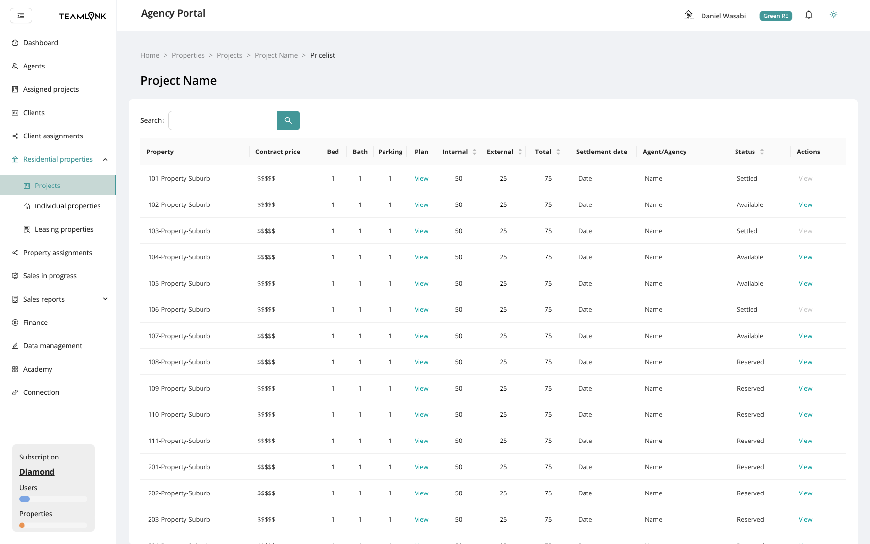
Agents often have a mental model shaped by their backgrounds in architecture or construction. The original flat list view failed to reflect the spatial nature of buildings. There was no distinction between floors or clear grouping — making it hard to locate and manage units efficiently.
Existing list view showed units linearly, mixing floors and types
Agents couldn’t visually orient themselves within projects
UI did not reflect the way buildings are structured
Agents need extensive scrolls or extra steps (filtering the unit types) to find the units in higher levels.
Opportunity & The Design Insight
Leverage agents’ architecture backgrounds
Create a visual structure based on building floors and stack logic
Reduce visual scanning burden and support at-a-glance decisions
While exploring ways to restructure the interface, I asked myself:
"What if we visualized unit data the way a building is actually constructed?"
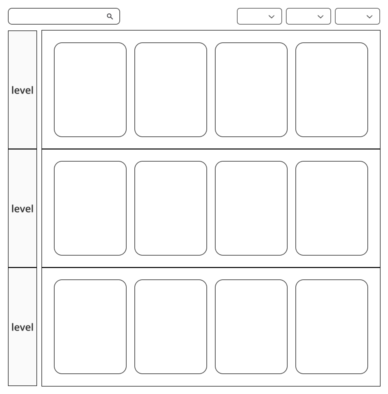
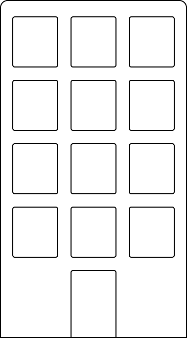
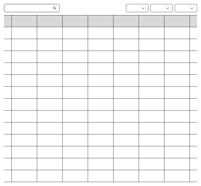
That led to the concept of Stack View — a floor-based grouping of units, mimicking physical stacks in architecture. I tested three layout models and validated their pros and cons with sales and support staff. Stack View emerged as the most intuitive and scalable solution. This idea resonated with our internal sales team immediately.
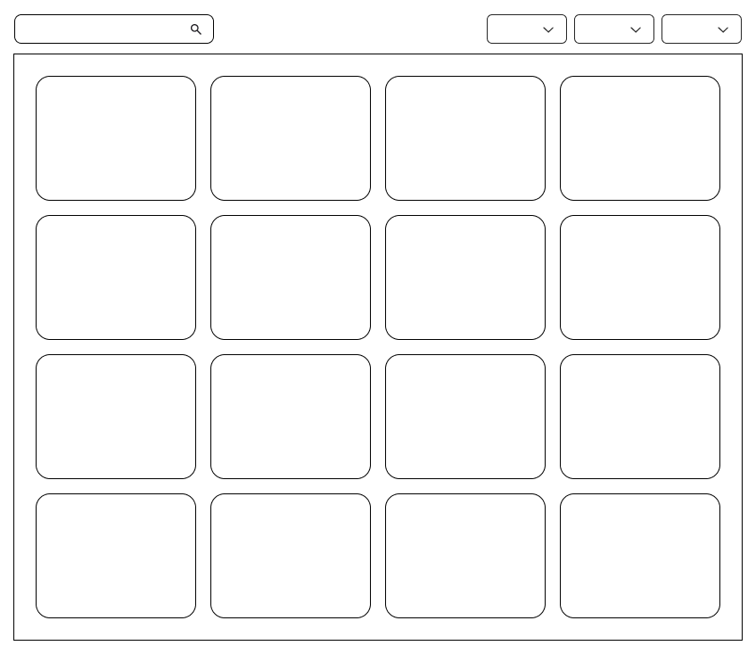
Building Sketch turns into the level-based stack view
Existing Flat List View
Grid View
Structuring the Stack View
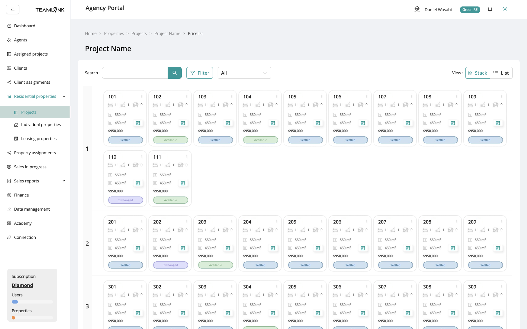
I designed the final layout to:
Group units by floor, mimicking building layout
Use consistent color codes for unit status
Minimize navigation depth, with all actions directly accessible
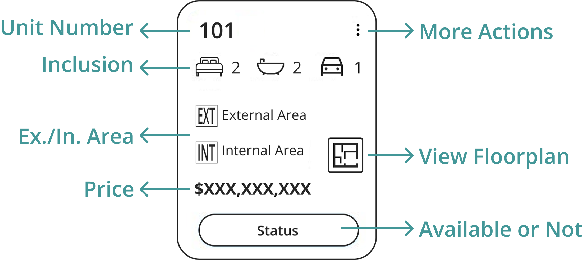
Stack Card Design
High Fidelity Prototype - Stack View
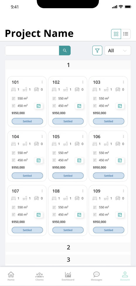
Mobile Stack View
Result
The new Stack View didn’t just look better — it worked better. Agents were able to find units significantly faster, and confusion about floor-level availability dropped.
Metric
Unit lookup speed
Time to first action
Development time
Outcome
⬇ 40% faster (internal tests)
⬇ from 10s → 7s (shadow monitoring)
3 sprints
Reflection & Design Philosophy
As a startup, we had no formal UX research team or budget.
So we initiated informal testing sessions with internal sales staff. I translated their frustrations into actionable insights and built rapid Figma prototypes to validate the layout logic. The final product was soft lauched and users are encouraged to explore the Stack View while being shadowed by the team.
Despite resource limits, the team backed the Stack View direction after I presented the early flows, and we launched the feature within two sprint cycles.
This project reinforced my belief in:
Domain-informed UX (understanding architectural logic)
Reducing cognitive load through layout hierarchy
Working lean without sacrificing strategic thinking


